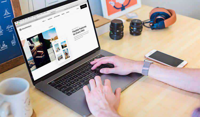
Having a responsive website that looks great on all devices is crucial. As such, responsive website mockup templates have been designed to help you and your clients visualize how a website design will appear on various screen sizes, typically on a mobile phone, tablet, and desktop computer.
They allow you to analyze and display how your web layout’s components and elements will look and function on various devices and sizes.
Many responsive website mockup templates are available online and vary in complexity and features. Some templates have been designed specifically for certain types of websites, others focus on a website’s branding, while others are more general-purpose.
Creating different device mockups for various screen sizes can also be time-consuming, but with some help, you can easily show how a website will look with the free responsive mockup templates we have for you today.
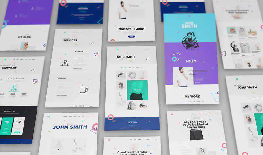
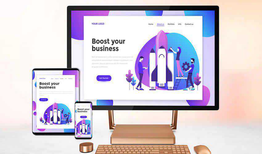
Perspective Web Mockup
Photoshop PSD Format
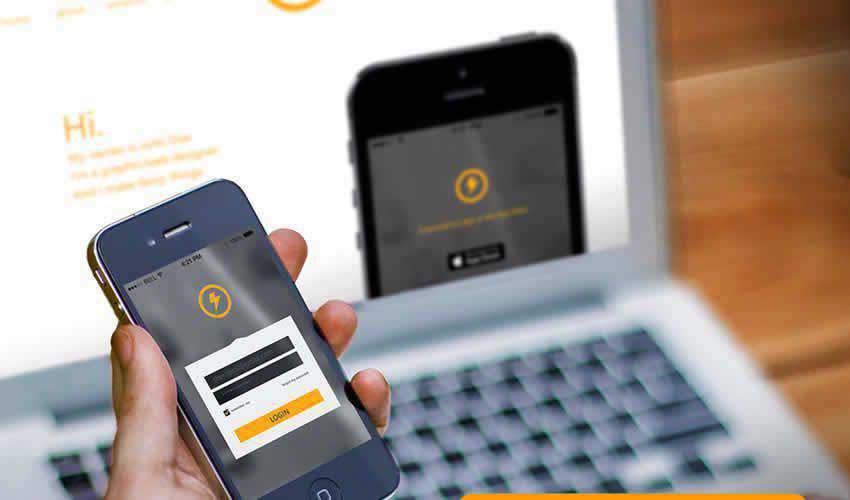
This web mockup will make your project stand out and capture your clients’ attention. It features a perspective view of the website in mobile screen sizes. Thanks to smart objects, all you have to do is drag and drop your design into the PSD file and export it.
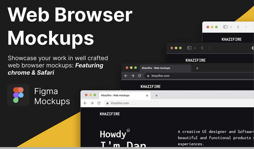
Web Browser Mockup Templates
Free in Figma Format
This is a collection of Chrome and Safari web browser templates of various sizes and styles that will allow you to present your website designs in a realistic online context.
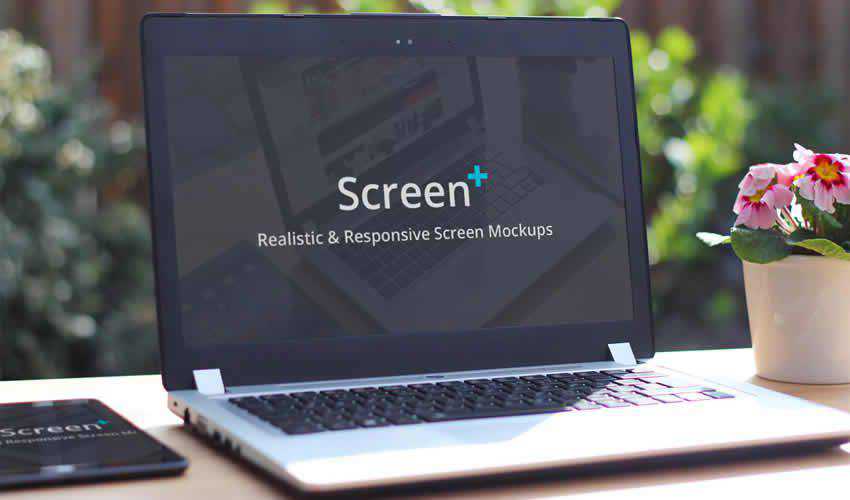
ScreenPlus Realistic & Responsive Screen Mockups
Photoshop PSD Format
If you’re looking for an easy-to-edit mockup, look no further than this screen mockup pack. It includes ten unique mockups, all of which use smart objects for easy editing.
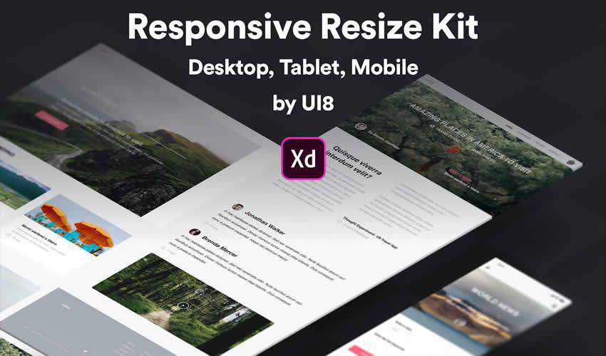
Responsive Resize Kit for XD
Free in Adobe XD Format
If you prefer working in Adobe XD, this responsive kit is the perfect choice. The kit contains different mockups for desktop, tablet, and smartphone devices. You’ll find three large desktop screens, three desktop screens, one desktop overlay, three tablet screens, three mobile screens, and one mobile overlay screen template.
Responsive Screens Mockup Templates
Photoshop PSD Format
This mockup pack features a clean design style and includes six different mockups in high resolution. You’ll find different device sizes, and the mockup contains smart objects for easy editing.
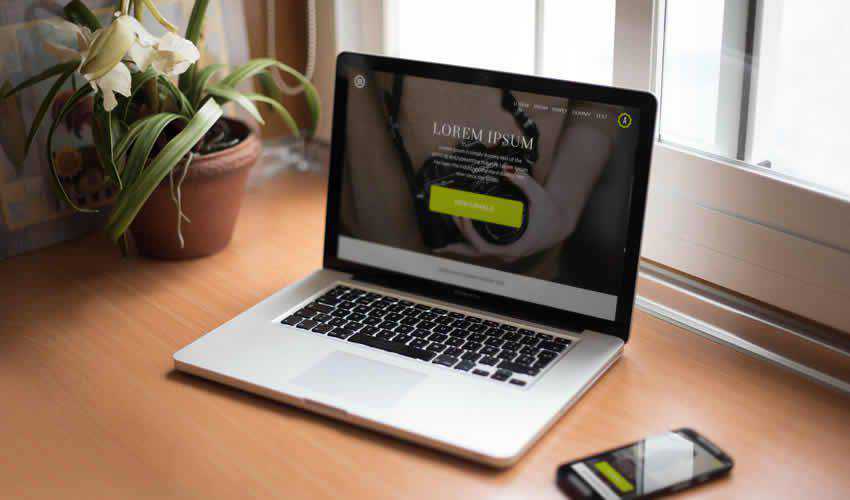
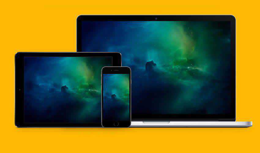
Smartphone & Notebook PSD Mockups
Free in Photoshop PSD Format
This pack contains seven free smartphone and Macbook Pro mockups. All mockups use smart objects, so adding your finished design is easy and quick.
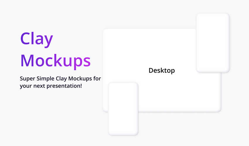
Clay Device Mockup Templates
Free in Figma Format
These ultra-minimal clay templates are perfect for quickly creating mockups in Figma. It includes a desktop, tablet, and various popular mobile device mockup templates.
Responsive Photoshop Mockup UI Template
Free in Photoshop PSD Format
This free mockup template contains four different device sizes: a desktop, a smartphone, a tablet, and a laptop mockup template. The template can be used for personal and commercial projects and includes a high-resolution file with smart objects.
Macbook Touch Bar Mockup Website Templates
Photoshop PSD Format
If you’re looking for a simple way to present your responsive website design, this mockup template is perfect. It includes a high-resolution, layered PSD file with smart objects, perfect for business website or app mockups.
Dark Devices Sketch Mockup Templates
Free in Sketch App Format
Try this template if you’re designing a website using the Sketch App. This mockup features a dark style, perfect for making your website design mockup stand out. The template includes a desktop and a smartphone mockup.
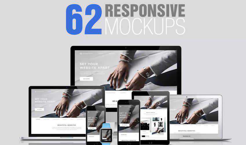
62 Responsive Mockup UI Templates
Photoshop PSD Format
Never run out of different ways to present your responsive website design again. This huge template pack contains 62 high-resolution mockups. The pack includes fully layered PSD files and smart objects for easy editing.
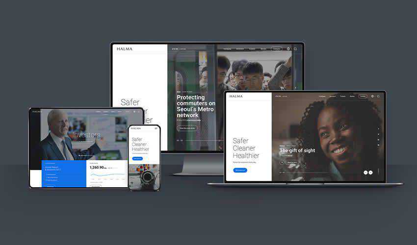
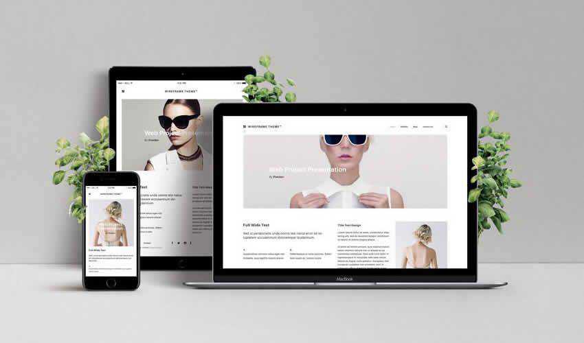
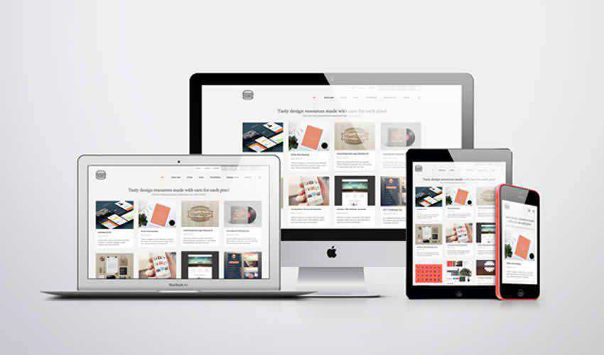
Responsive Web Design Showcase Mockup
Free in Photoshop PSD Format
This mockup features a MacBook, iPad, and iPhone, and it is a great way to showcase your responsive web designs. The template includes a high-resolution, high-layered PSD file with three smart objects.
Responsive Mockup Templates
Free in Photoshop PSD Format
This set of templates includes ten unique designs with smart objects, which makes editing them a breeze. You can also easily adjust the blur. The template is free to download and use in any type of project.
Apple Responsive Screen PSD Mockup Template
Free in Photoshop PSD Format
This pack is perfect for adding a touch of class to your project presentation. The set features a variety of Apple devices, and you can easily add your design by editing the smart objects.
Responsive Mockup Template
Free in Photoshop PSD Format
This free mockup is a great way to present your website design when you need to create something quickly. The mockup template contains a single, layered PSD file with three screen sizes.
Conclusion
Make sure your clients know how their website will look when viewed on different devices with one of these responsive mockups.
The best part is that you only have to download them once and reuse them in future design projects, so be sure to check them out.